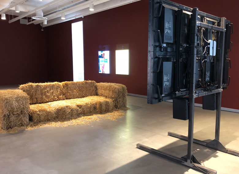
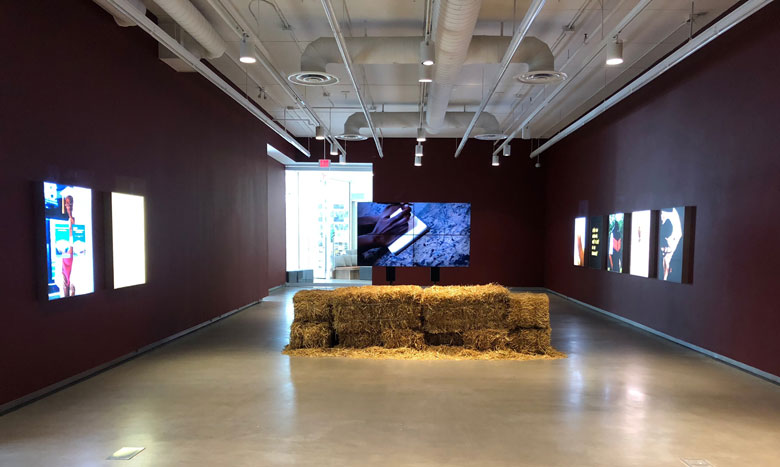
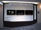
In July, I dropped into the Plug-In Institute of Contemporary Art in Winnipeg to see DIS Collective’s Thumbs That Type and Swipe: The DIS Edutainment Network. Walking into the gallery was like stepping into the backstage area of a convention or education fair. Normally, galleries arrange their artwork to face patrons like items in a department store, on display for consumption. This installation, edited down from the first iteration shown in Madrid in the spring, was different. When I entered the space, I heard the audio track of a video, but could only see the backs of four monitors combined on one stand. On the walls beside the display were backlit posters, the size of transit ads. Having to walk around the video set-up to see the pieces in Thumbs That Type and Swipe made me conscious of how the installation was put together by artists and technicians.
Facing the AV equipment was a couch made of small, square hay bales, the type that was ubiquitous on Prairie farms into the 1970s, and for which I felt a wave of nostalgia. As a kid, I sat on hay bale bleachers at Christmas parties hosted by my dad's trucking company bosses. We watched cartoons projected onto a cloth screen that was about the size of the four monitors in the gallery. Speaking of cartoons, the "host" of the video compilation, titled DIS.ART (2018), is a cartoon character named Chus. Chus is an eye within a mouth, animated in a psychedelic style reminiscent of the Beatles' 1969 film Yellow Submarine. Chus appeared in the short introductory or intermission-like segments between the collection’s 19 videos.
The video compilation exemplifies DIS’ appropriation of the “edutainment” (education and entertainment) format. The most famous example of edutainment is the long-running children’s television show, Sesame Street. Each episode of Sesame Street is comprised of short segments (think of them as short films) with an educational message conveyed in an entertaining manner. I remember segments on how to count to 12, or why it’s okay to be different, specifically because of the catchy songs, funky animation, and adorable singing Muppets.
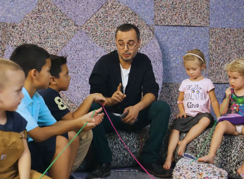
At a broadcast-friendly 55 minutes, DIS.ART is analogous to Sesame Street. Each segment has a didactic goal and a distinct style. The segment that was playing when I walked into the gallery was Circle Time with Babak Radboy, produced by the DIS collective (many of the other videos were produced independently). Artist Radboy adopts a storytelling style and cadence to explain the relationship between capitalism, art, and labour to a group of children sitting and playing on felt furniture, the 21st century daycare equivalent of hay bales.
This video was followed by Reparation Hardware, a gentle satire by Ilana Harris-Babou, about a project to repurpose artifacts from the United States’ slavery-driven homesteading past to build a more inclusive future development—hence the word plays on "reparations" (for descendants of African slaves) and “Restoration Hardware” (the faux-antique retail chain). Reparation Hardware presented a subtly satirical counter-narrative on a very large canvas. The scope of reparation items go from the home to the homeland: the music builds to a crescendo as the film shows Harris-Babou making new decorative pieces from reclaimed barn wood, then later standing in a vast field that represents land taken from indigenous populations and land denied to the slaves who worked it.
On the absurdist end of the spectrum, Will Benedict and Steffen Jorgensen’s The Restaurant, E1: The Average Chef imagines a skyscraper in which each suite is occupied by a different restaurant, some with very high-concept ads. A chef’s simple question to Siri (“How do you make fries?”) turns into a video collage that spoofs cooking shows and highlights how food is produced, talked about, presented, and advertised. Darren Bader’s What Is an Egg? also comments on mass media. Bader uses the person-on-the-street interview format to show its limitations. When asked the question "What is an egg?", people can’t give a yes-or-no answer, nor can they fall back on talking points they’ve heard on news programs. The interviewees interpreted the open-ended question as if they were interpreting art, leading to some astute answers, some free associative responses, and some outright bafflement.
In some videos, the line between satire and sincerity is as thin as the veil between education and entertainment.
In some videos, the line between satire and sincerity is as thin as the veil between education and entertainment. Among these videos are Mothers and Daughters by stand up comic Casey Jane Ellison, which so perfectly captureds mommy blogging and lifestyle shows that I initially took it to be sincere, and Jacob Hurwitz-Goodman and Daniel Keller’s The Seasteaders, about a real life libertarian’s proposed floating, modular, government-free community that sounded so outlandish, I thought it was satire.
Like an episode of Sesame Street, the compilation segments in DIS.ART were varied in content, style and memorability. However, sensory and idea overload set in after seeing all the videos in an unbroken, hour-long stretch. The DIS collective's main outlet is their website, http://dis.art/, which is described as “a streaming platform for entertainment and education—edutainment.” Watching DIS.ART at the gallery felt like binge-watching TV shows, but watching the videos on the DIS website felt more manageable and akin to a traditional gallery experience. DIS streams about three videos each month. Each piece is accompanied by a brief artist’s statement, so you can take time to appreciate each work and read the didactic. You can keep revisiting the work until the videos are cleared out for the next month’s "installation".
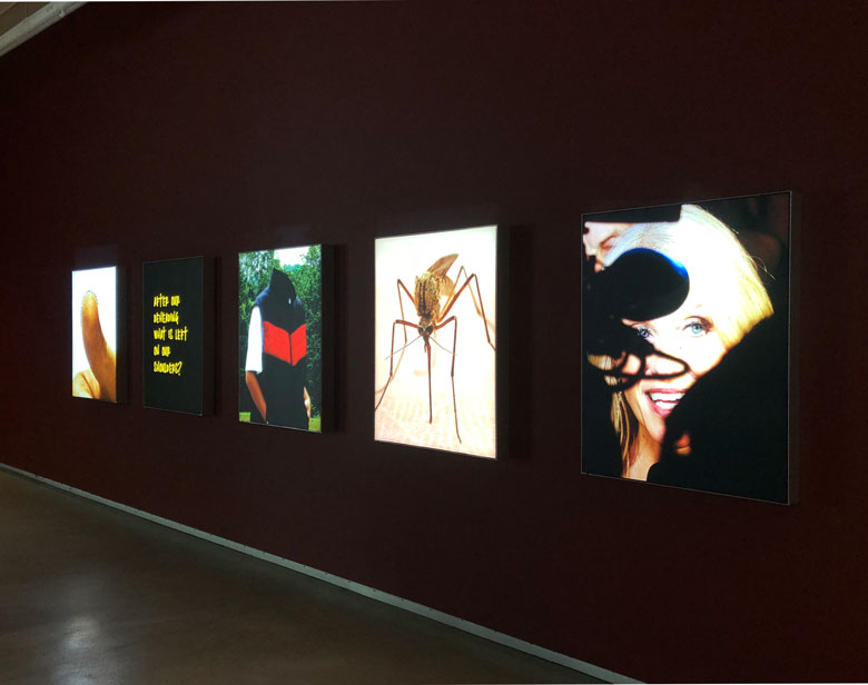
After watching DIS.ART, I turned my attention to the posters, collectively titled Onboarding: Thumbs That Type and Swipe. It consisted of seven 38" x 29" lightboxes, with design by Chris James and additional text by Drew Zeiba. These lightboxes led me to reflect upon the number and type of corporate messages that impinge on public spaces. It is common for formerly commercial-free civic parks and services to be supported by advertising or to be named after sponsors who have made large donations. Ads do bring revenue into a city's coffers, but people's attention is continually taxed by branding and commercial messages, however subtle.
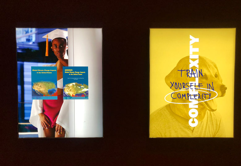
Two posters near the back of the space specifically explored the uneasy relationship between corporate and civic interests. One featured the image of a man in a V-neck sweater wearing a mask of a dog’s head, which reminded me of recruitment ads for postsecondary education institutions. This poster was “graffiti’d” with the punny remark, “Train yourself in complexity.” The statement is a bit of an oxymoron: training a person as you would a dog suggests a narrow command structure more suitable to a workplace training program than the romantic notion of classic liberal education.
Another poster features a figure (or two, depending on how you read the image) that appears to be collaged from commercial stock photos. The head belongs to a young, male student of African descent who wears a white graduation cap. This head is connected by an elongated neck to a body seems to be that of a black female catalogue model wearing a white swimsuit cover-up. Superimposed on this contorted figure is a climate-change report by the Cato Institute, co-founded by oil billionaire Charles Koch, which has a correspondingly contorted stance on climate change. Significantly, the collaged body has brown skin and is adorned with white garments (the graduation cap and the cover-up), possibly representing the populations that are most likely to suffer the ill effects of climate change. In this poster, the politics of race, education, science, and environmentalism distort the public body, specifically those living in less affluent regions of Africa and South America.
The other grouping of posters includes one that lends its title to the exhibit, Thumbs That Type and Swipe. The words outline the pad of a large thumb, announcing the show’s scope: anything that has to do with, and can be made by, "digit"-al media. This is followed by a diptych of posters that tap into the “Just Do It” philosophy and aesthetic of Nike ads, except that the figure wearing sports gear is headless, like the Ancient Greek statue of Nike of Samothrace. Next is an image of a mosquito resting on human skin, and last is a photo of Kellyanne Conway, who was the Counselor to the President of the United States at the time of the exhibit, whose face is obscured by camera equipment. From a distance, these last two images leave the same visual impression: dark stingers and legs, microphone stands and cables against a hay-coloured background. The Nike, mosquito, and Conway images could be read separately, or together to suggest a visual narrative. I could not resist thinking about the commonalities between a shoe company that trades in emotionally manipulative advertising, a literal bloodsucker, and an icon of deception.
The exhibit challenged the complacency of nostalgia without questioning the past, and media consumption without questioning its contents or methods.
Thumbs That Type and Swipe was part of Plug In ICA's annual Summer Institute, designed for artists working at the post-graduate level to further their practice. DIS ran the first of two sessions of Plug In’s 2018 Summer Institute. (A second session, led by BUSH Gallery, took place in August.) While Thumbs That Type and Swipe occupied one of the two gallery spaces at Plug In, the other gallery was converted into a work space for summer institute participants. DIS co-founder Marco Ross facilitated the first session, inviting artists (including the aforementioned Ilana Harris-Babou) and other thinkers to give talks or lead activities in response to the show's themes. Institute participants created work that was guided or inspired by these sessions. The work being done at the summer institute was not technically part of the exhibit. However, the activities took place in a glassed-in room that could fancifully be counted as an item of Thumbs That Type and Swipe. The institute was another mode of education in DIS' portfolio.
My first impression of Thumbs That Type and Swipe was based on the first few playful, colourful, and informative videos, which pointed to a gentle, art-based version of Sesame Street. However, it was more intellectually demanding than passive media consumption habits, like idly swiping through profiles on Tinder or scrolling through Twitter, alluded to in the title. The exhibit challenged the complacency of nostalgia without questioning the past, and media consumption without questioning its contents or methods. The show was both engrossing and exhausting. At one point, I was tempted to sit on the hay bale couch, but instead of old-timey rope, the bales were bound together with metal wire, or that's what it looked like. At any rate, what could have been an artifact of comforting nostalgia was tied together with a sharper edge.
Visit http://dis.art/ to watch the DIS Collective’s newly released videos.

